Intialization:
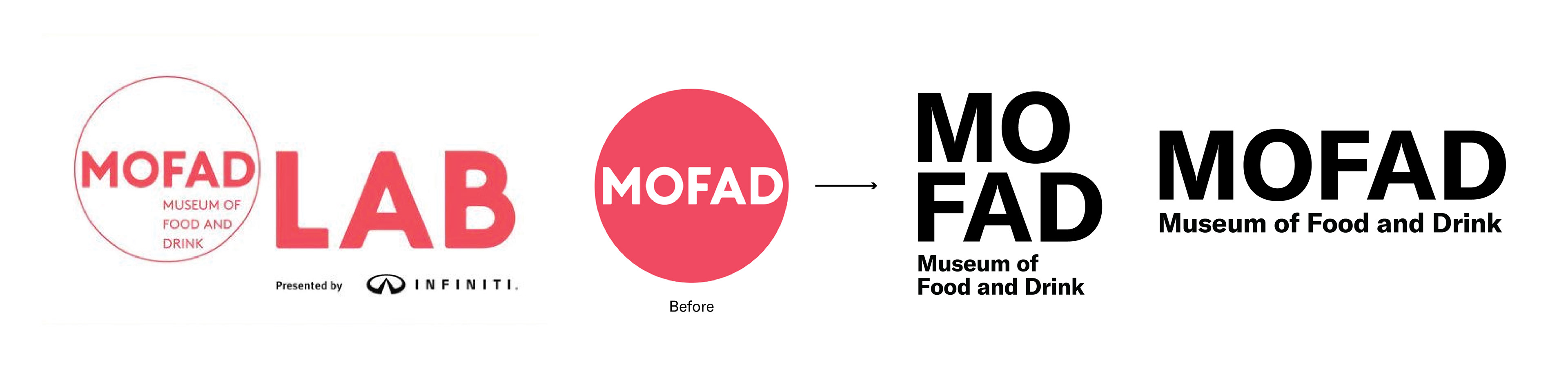
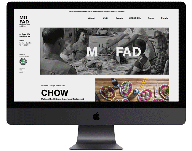
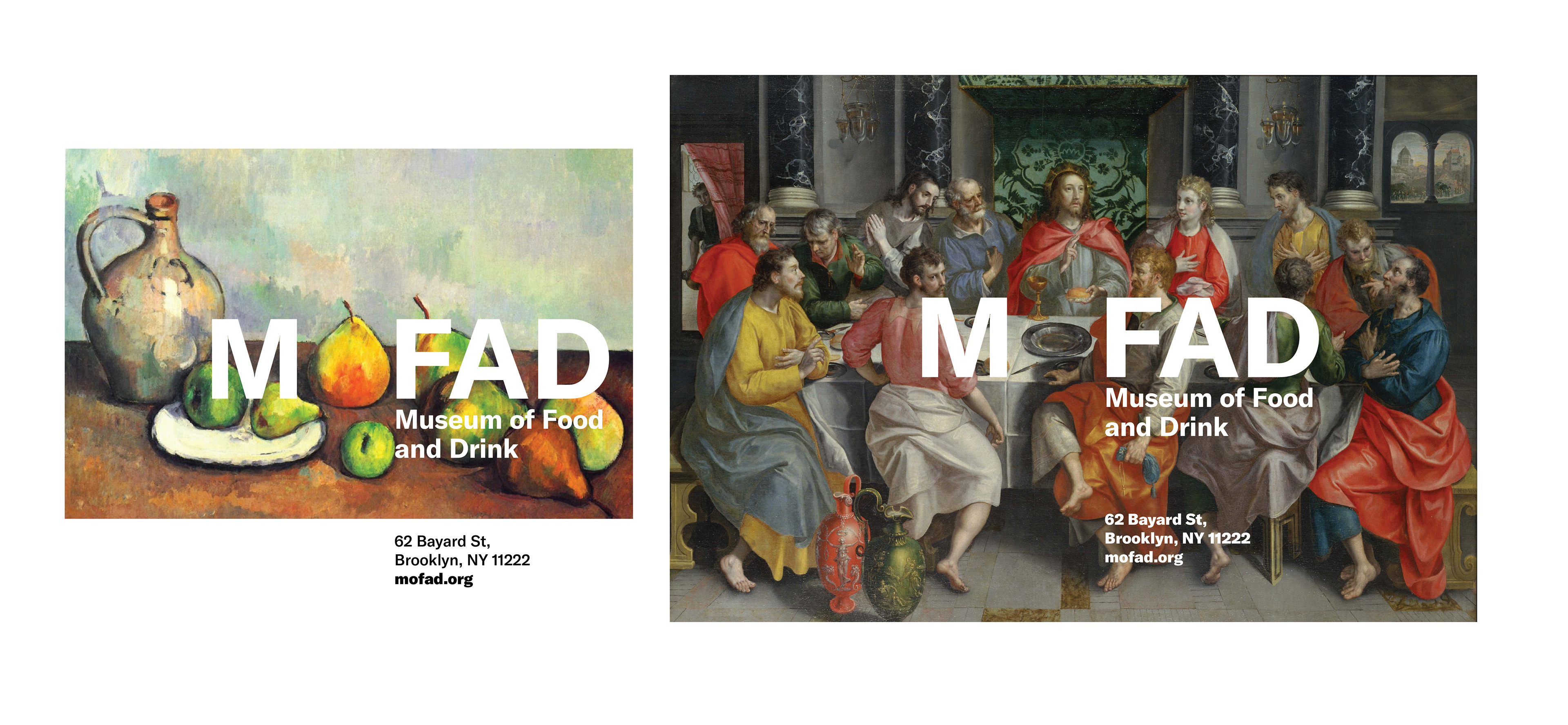
The original logo was set in a strong hot salmon pink color that induced a rather unappetizing presence. Because so much of the website was image based, the artificiality of the color often clashed and needed to be used in white. The new logo set in GT America Bold was intended to be present a clean, neutral slate for its advertisement campaigns. Compared to an established museum with a permanent collection, MOFAD is ever-changing and its exhibitions comprise the majority of its content. This template for modification also reflects the temporality of food, perishable and time-based.
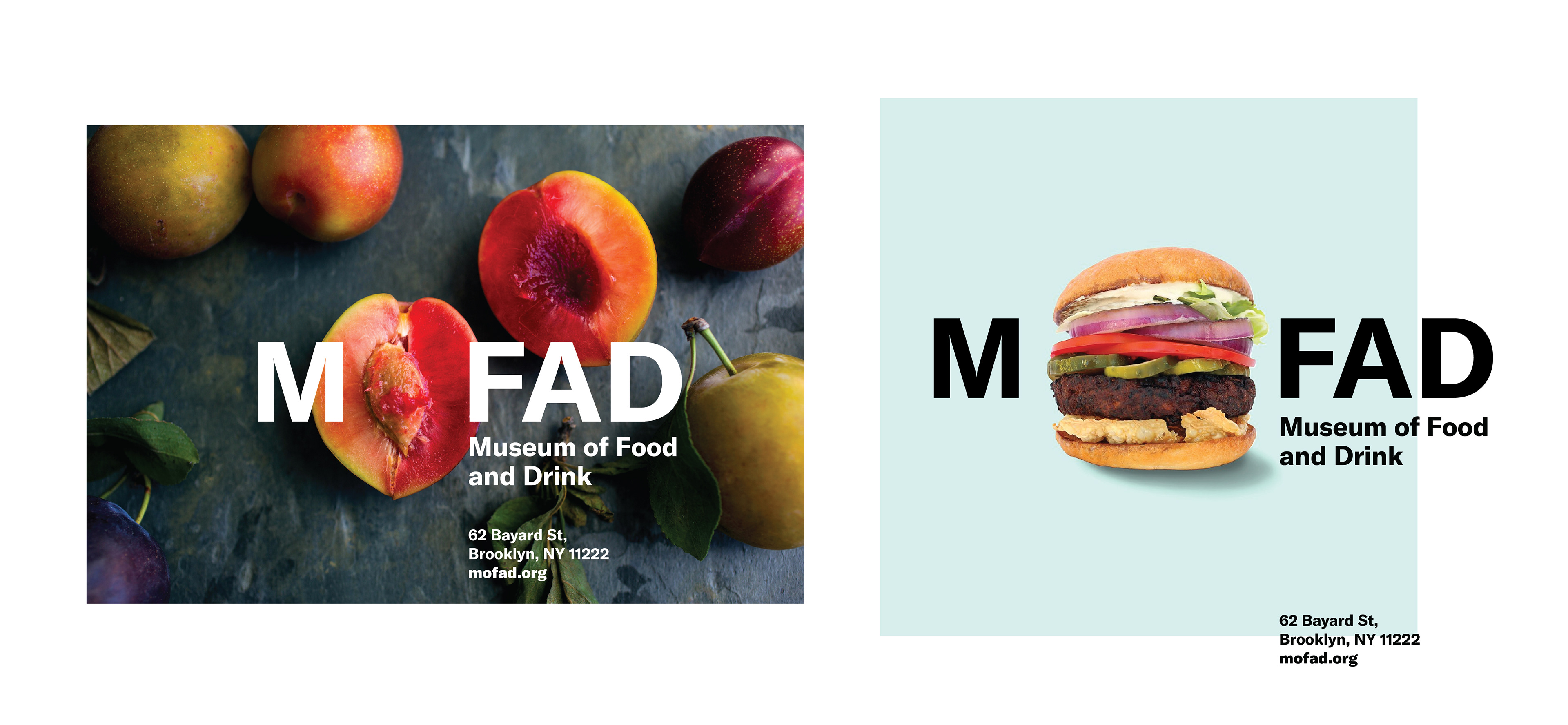
MOFAD's website attempted to convey this idea by using a stencil like silhouette of its logo on a circle but the complexity of the images behind it failed to create a compelling image and didn't have enough formal qualities to relate itself to the circular logo. However, the idea was there. Researching images of food, a lot of circular images continuously come up. There's the plate itself, and accompanying cup, the seed of fruits, the human mouth. Luckily, there's a convenient location for an circle in the logo itself.
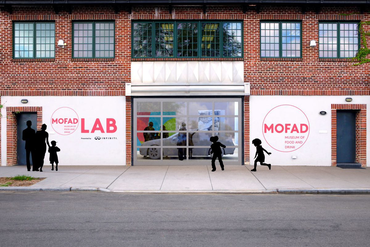
Outside Signage Before
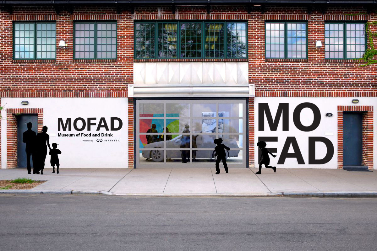
Outside Signage After